
Hero banner
showcase hero composes a banner from the raw captures: your logo, name and tagline, and framed shots
arranged by layout. The default, stack, puts the text on the left and one to three shots stacked and
tilted on the right. The default size, 1280x640, is GitHub’s
social preview size, so the same file works at the top of the README and as the repository’s preview
image. The hero block configures it; every key is optional.
A minimal banner
Section titled “A minimal banner”export default defineConfig({ name: 'Shiranami', // target, shots ... hero: { tagline: 'A music player for your own library.', logo: 'assets/logo.svg', shots: ['library', 'player', 'settings'], },});npx showcase all # the raw captures the hero readsnpx showcase hero # writes assets/showcase/hero.webpall does not render the hero; it is its own command. Every key is in the
config reference.
Composition
Section titled “Composition”- Text. The logo (fitted into a 96 px square at the default height), then
name, thentagline, vertically centered on the left. Therowandcenteredlayouts center it at the top instead. - Windows.
shotslists the shot ids to show, back to front, and defaults to as many of the first shots as the layout shows. Instack, each window is half the banner’s width and tilted a few degrees. Every window is framed with yourframesettings (style, theme, title, radius, shadow). The positions are fractions of the canvas, so a differentsizekeeps the composition. - Background.
backgroundtakes the same forms asframe.backgroundand defaults to it. - Text color.
themedefaults toframe.theme:'dark'gives light text,'light'gives dark text. Match it to the background, not the app.
The default stack on a mesh, a dots and a noise background, from the docs
gallery, which has the config of each. Select one to open the file.
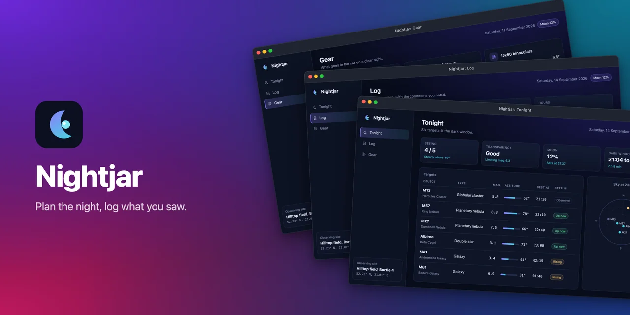
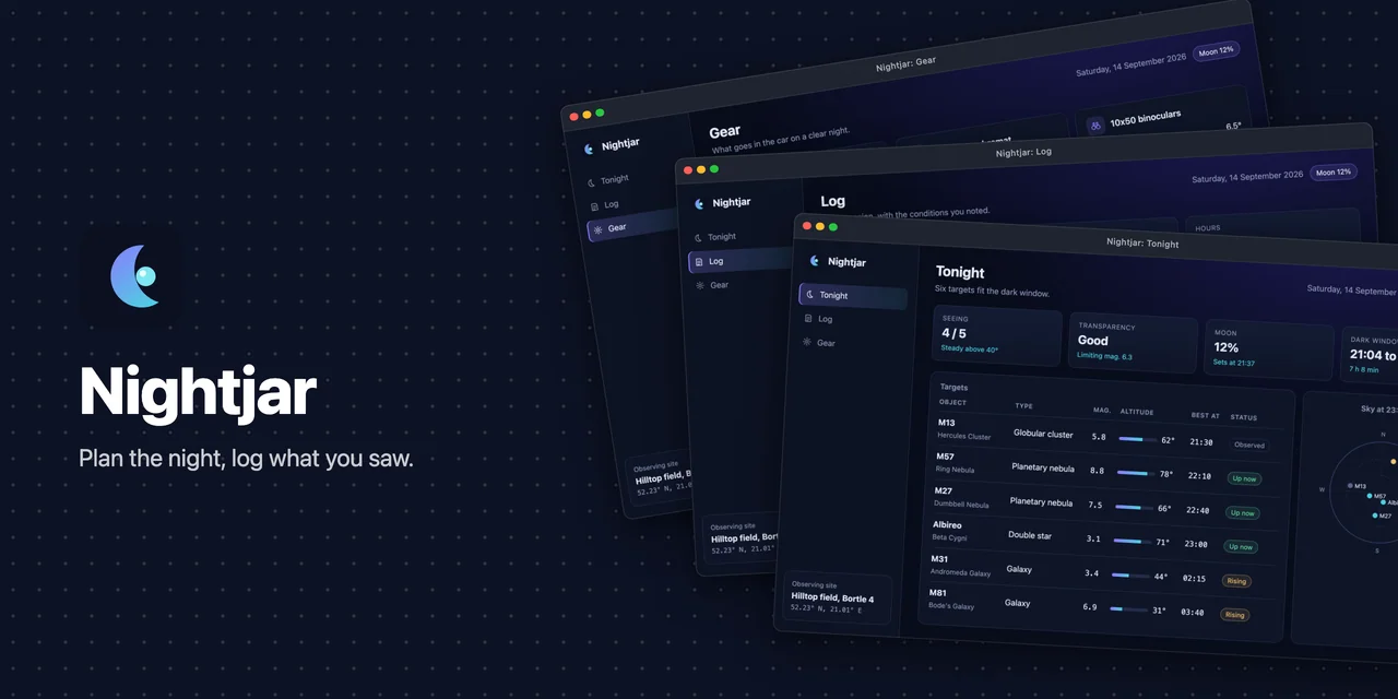
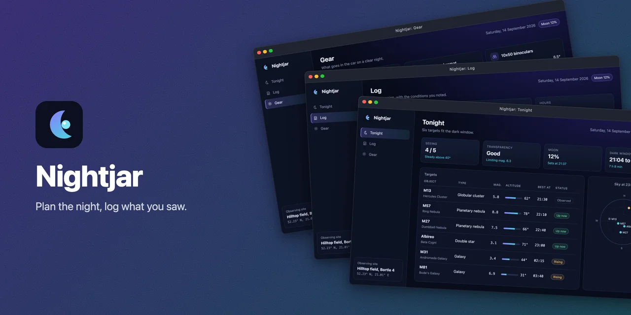
The banner is rendered at twice its size and scaled down to exactly size, for sharper text and edges
on the tilted windows.
Layouts
Section titled “Layouts”layout picks the composition. Every layout keeps size, background, theme and the frame look.
layout |
Shots | What it looks like |
|---|---|---|
'stack' (default) |
1 to 3 | Text on the left, the windows stacked and tilted on the right. |
'spotlight' |
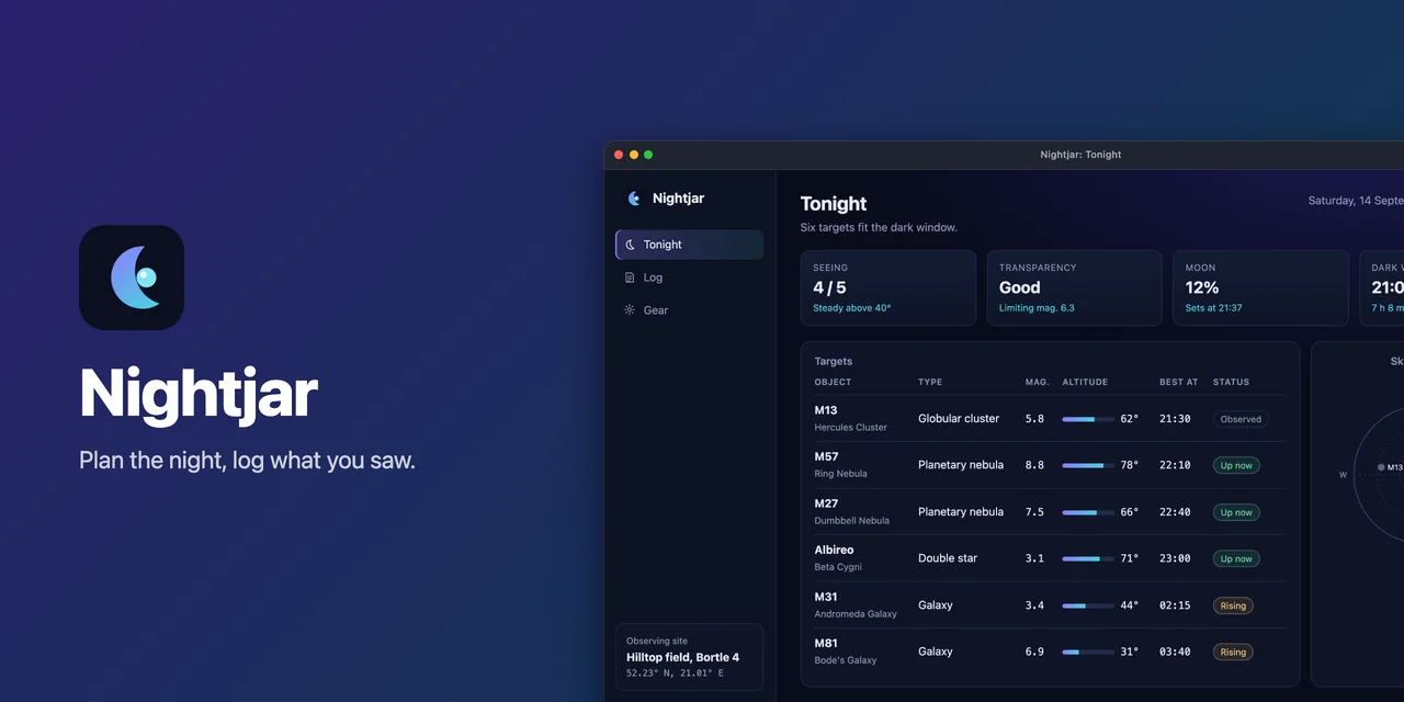
1 | Text on the left, one large straight window running off the right and bottom edges. |
'split' |
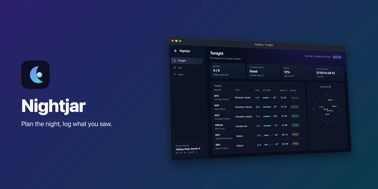
1 | Text on the left, one window turned in perspective towards it. |
'row' |
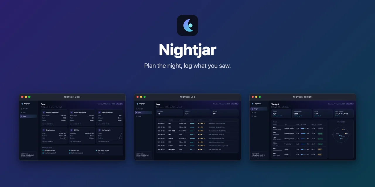
1 to 4 | Text centered at the top, the windows side by side under it. |
'mosaic' |
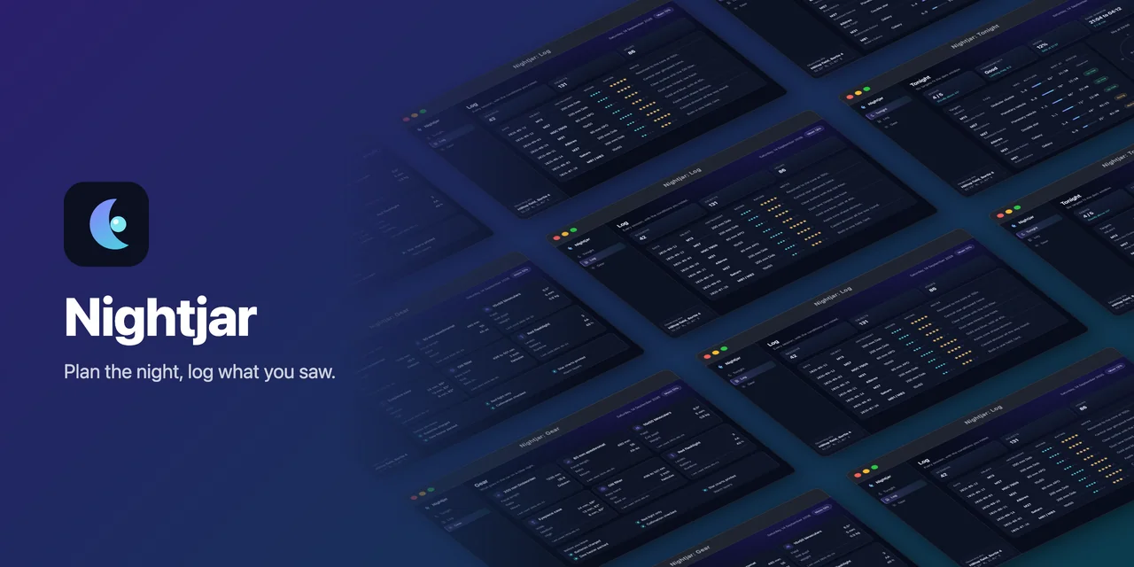
1 to 4 | Text on the left, a tilted wall of the windows (repeated to fill it), fading out towards the text. |
'centered' |
1 | Text centered at the top, one window rising from the bottom edge and leaning back. |
Each layout with Nightjar, the fixture app of the docs gallery. Select one to open the file; the gallery has the config that made each.
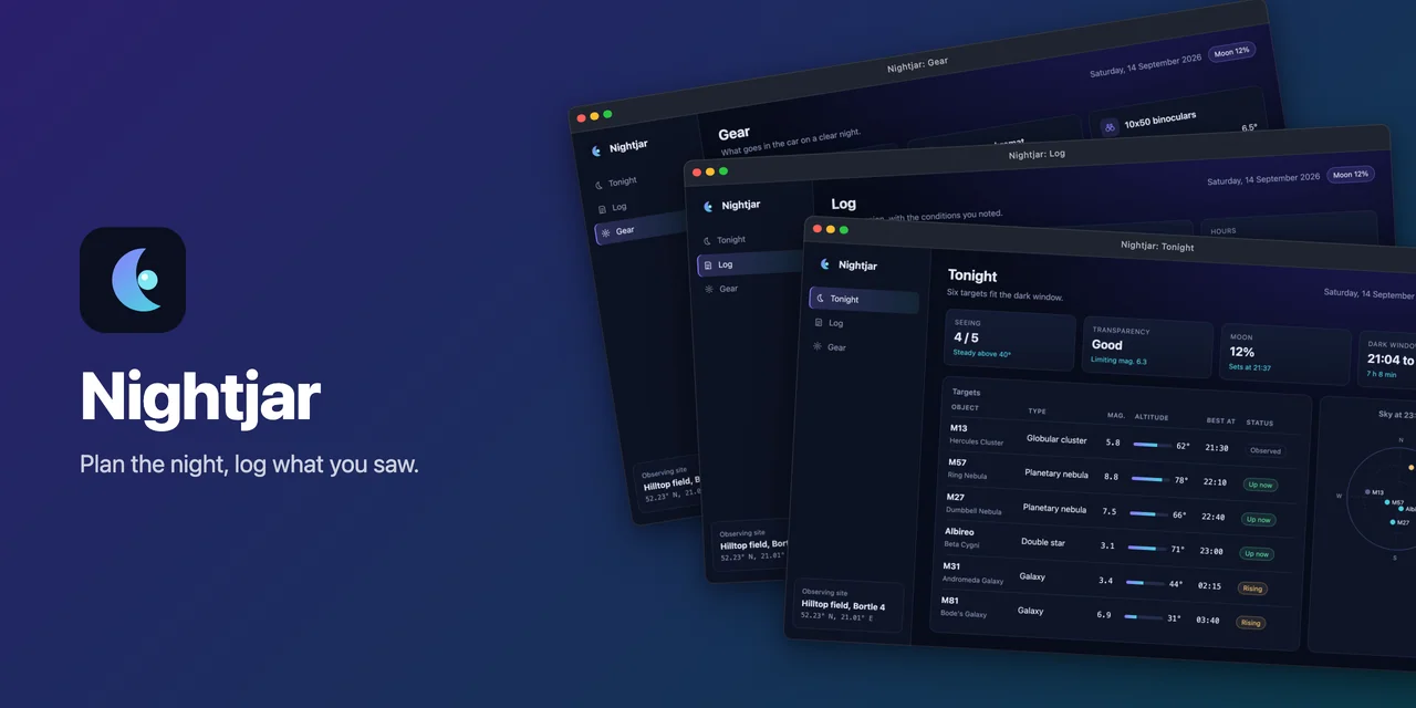
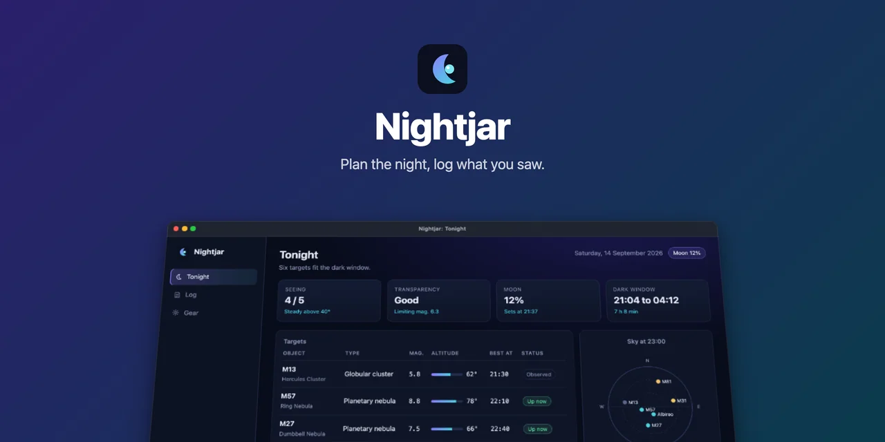
hero: { layout: 'spotlight', shots: ['player'],},A shots list longer than the layout shows is an error that names the layout, so switching from
stack to a one-window layout means picking the one shot to show. Without shots, each layout takes the
first shots of the config.
Logo, language and output
Section titled “Logo, language and output”logois a PNG, SVG, WebP or JPEG file, relative to the config’s directory. A missing file or another type fails when the hero renders.langpicks which language’s captures to use; it defaults to the first oflangsand must be one of them.output(defaultassets/showcase/hero.webp) must end in.webpor.pngand takes the tokens{lang}and{slug}.quality(default 90) applies to WebP.size(default[1280, 640]) is the exact output size, 320 to 8192 pixels per side.
Related
Section titled “Related”- Frames: the window look the hero reuses.
- README table: the images under the banner.
- CLI reference:
showcase hero.