
showcase-kit
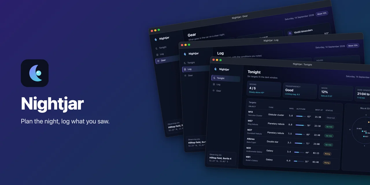
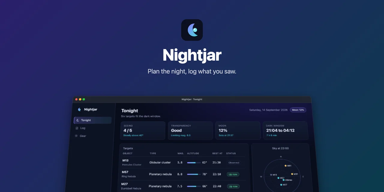
A hero banner the kit rendered from one config, for Nightjar, the fixture app behind the gallery. Every image there is a file the kit wrote.
Is this for you?
Section titled “Is this for you?”Yes, if you keep screenshots of an app in a README or a portfolio and retake them by hand every time the UI changes. The kit drives the app with Playwright: a web app in headless Chromium (a dev server it starts for you, or a URL that is already up), an Electron app over the Chrome DevTools Protocol, or a terminal app (a TUI or a CLI) in a pseudo terminal. You need Node 22 or newer and Playwright’s Chromium.
Probably not, if your app is a native desktop app that is neither a web view nor a terminal (Qt, SwiftUI, WinForms): there is nothing for the kit to attach to. Tauri on macOS and Linux has no DevTools Protocol either, so there you capture the app’s web build instead (Tauri explains the trade-off). The kit also cannot make a changing app look the same twice on its own: if every run shows new data, the images change with it until you give the app a fixture mode. And clips (animated recordings) are for terminal apps only, so far.
What one config produces
Section titled “What one config produces”- Raw capturesPixel-exact PNGs at a fixed viewport and device scale factor, in every UI language.
- Framed README imagesEach capture in a window, browser or terminal frame on a solid, gradient, mesh, dotted or grainy background, as WebP or PNG.
- README snippetThe framed images with captions as HTML to paste into a README: a table, rows, a featured image, collapsible details or a list.
- Portfolio imagesExact-size 16:9 images with the framed window contained, never cropped, plus a thumbnail and a gallery JSON.
- Hero bannerLogo, name, tagline and framed shots in one of six layouts, 1280x640 by default.
- Terminal clipsShort animated WebP and GIF recordings of a terminal app (MP4 opt-in), framed like the stills.
- App iconsWeb, Electron or Tauri icon sets (PNG, .ico, .icns) from one square image. Needs no config.
showcase all runs capture, frame, then the portfolio export when it is configured, then the clips when
there are any. The README snippet, the hero banner and the icons are their own commands.
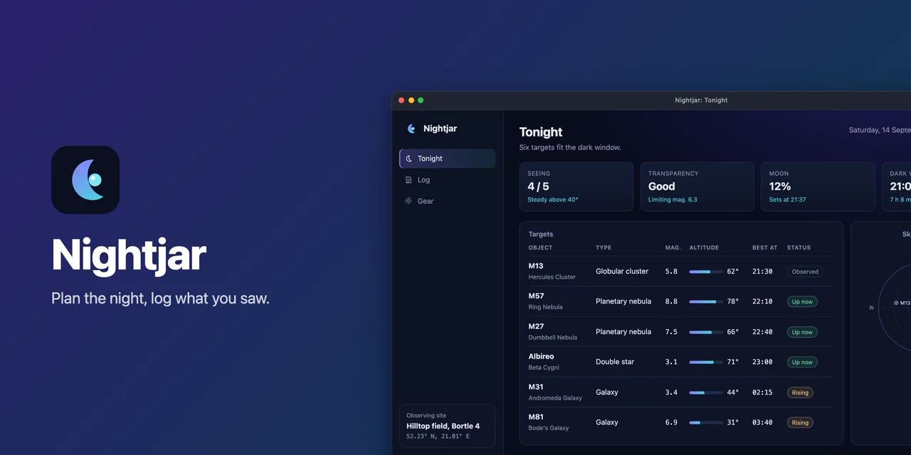
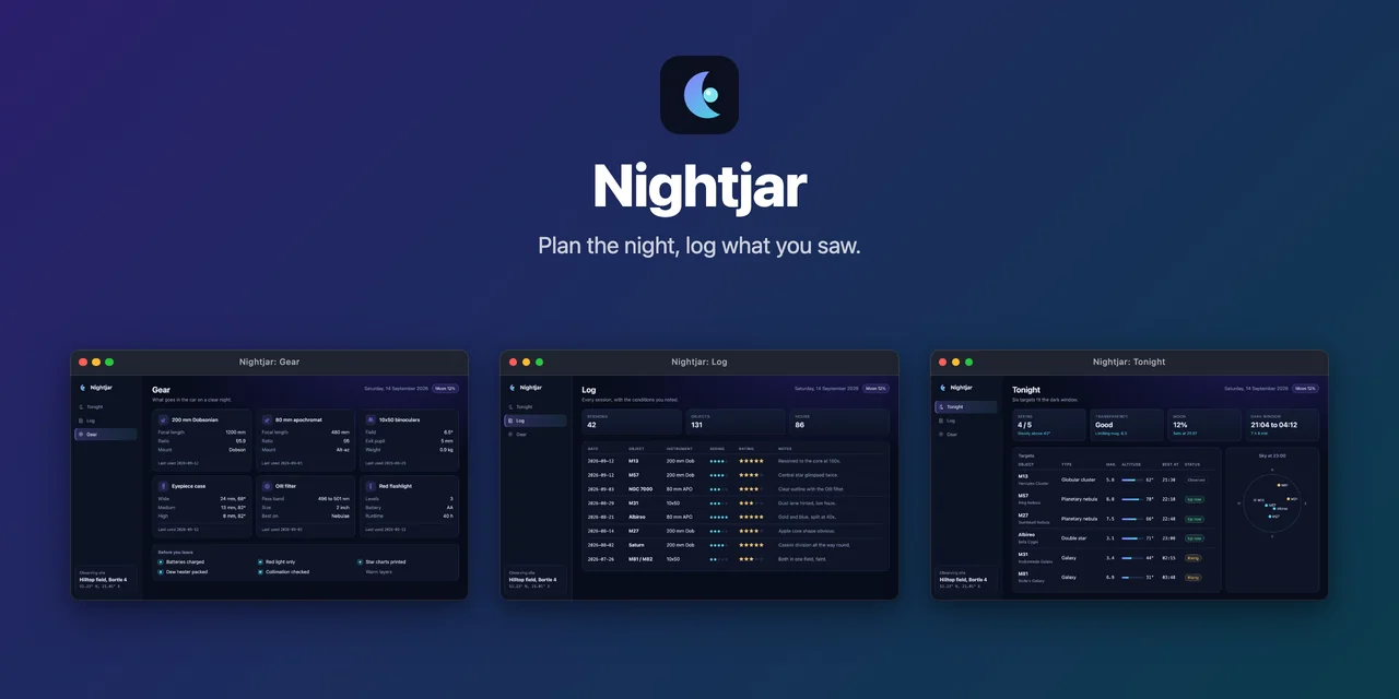
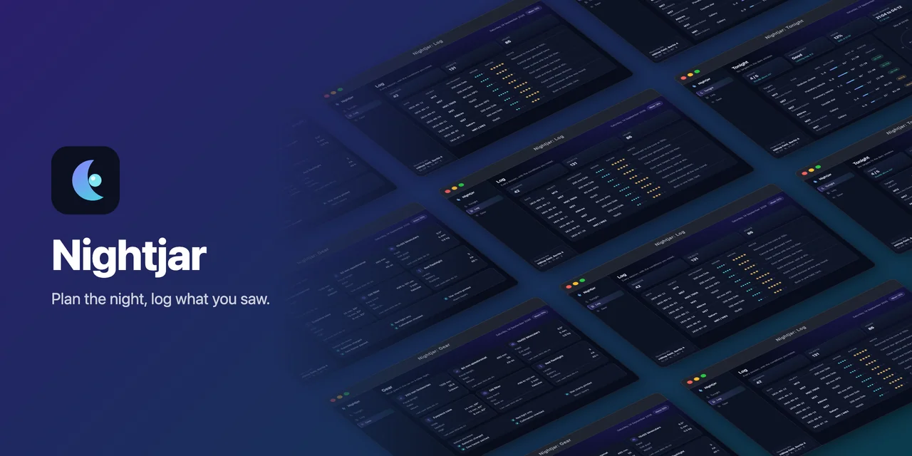
Six hero layouts, six frame styles, six kinds of background and five README layouts, all shown in the gallery with the config that made each. Four of the hero layouts, for Nightjar:
A minimal config
Section titled “A minimal config”import { defineConfig } from '@noctcore/showcase-kit';
export default defineConfig({ name: 'My App', target: { mode: 'url', url: 'http://localhost:5173', start: 'pnpm dev' }, ready: '#root > *', shots: [ { id: 'dashboard', title: 'Dashboard', nav: '/' }, { id: 'reports', title: 'Reports', nav: '/reports', waitFor: '[data-testid="chart"]' }, ],});npx showcase all starts pnpm dev, waits for the page, captures both views at 1440x900 and device
scale factor 2, writes the framed images to assets/showcase/en/, and stops the dev server again.
Getting started walks through it from the install.
How these docs are built
Section titled “How these docs are built”The guides are written by hand, and what they say the kit does is checked against the library’s source. The
reference pages are generated from that source, and the
changelog is generated from the repository’s CHANGELOG.md, so a release
shows up here without anyone editing a page.